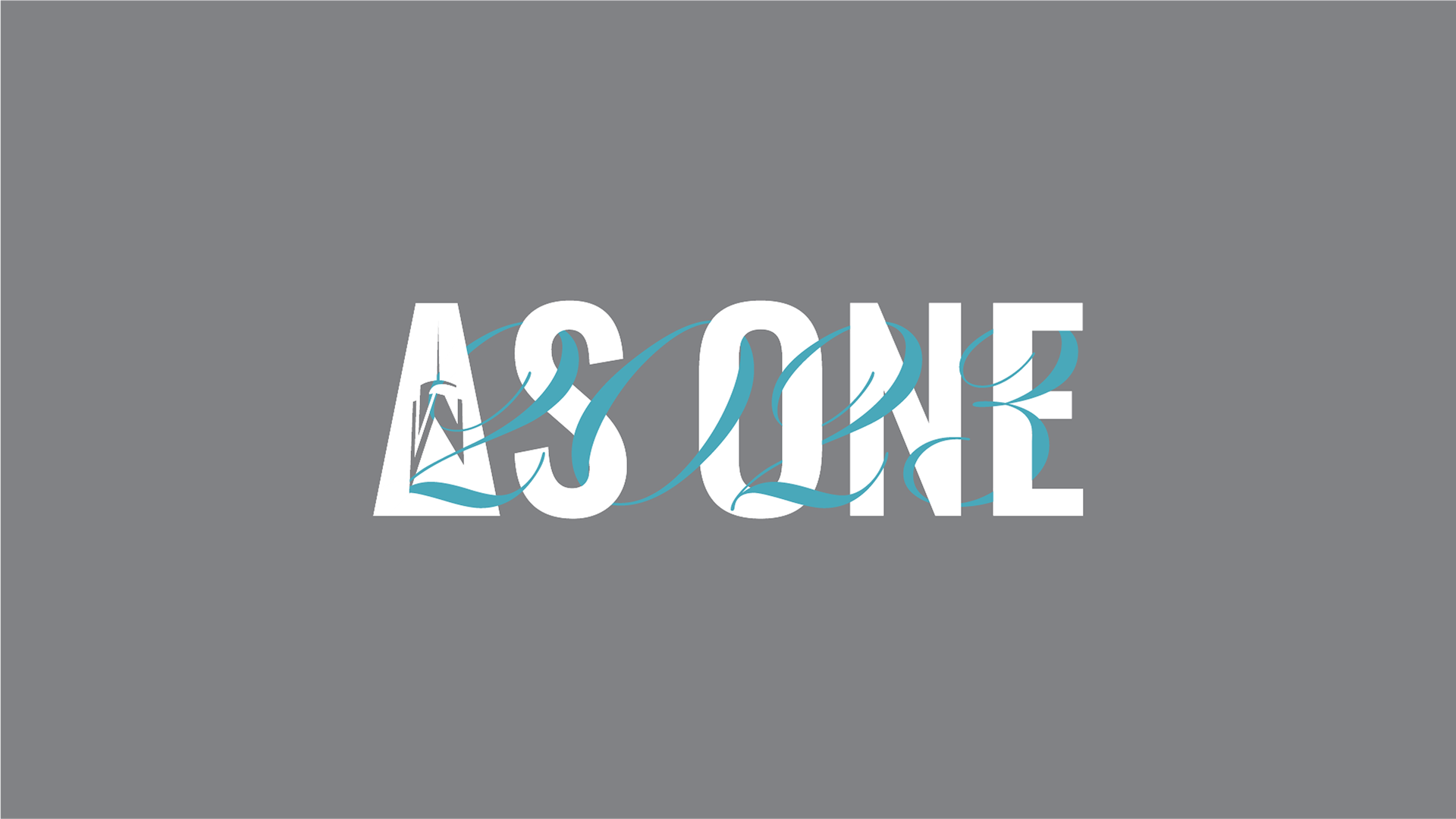
I was tasked with refreshing the internal wordmark to be used within One World Trade's observatory, café, and restaurant for 2023. While adhering to their brand's guidelines for color, sizing, and font choices, I paired their existing logo with the slogan for the new year "As One". The wordmark is meant to be used on employee identification cards and merchandise throughout the tower.
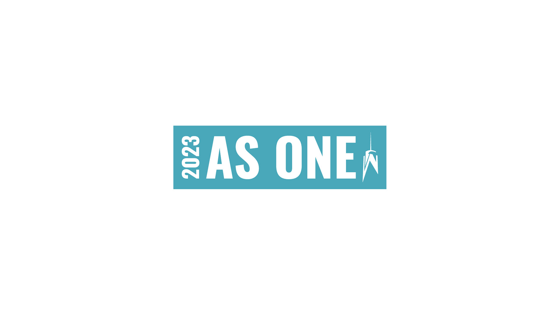
As One Wordmark horizontal white text on blue knockout with year and logo
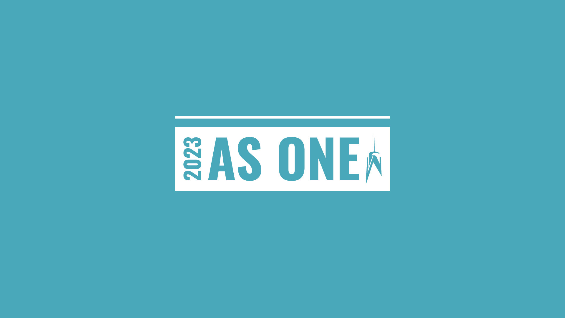
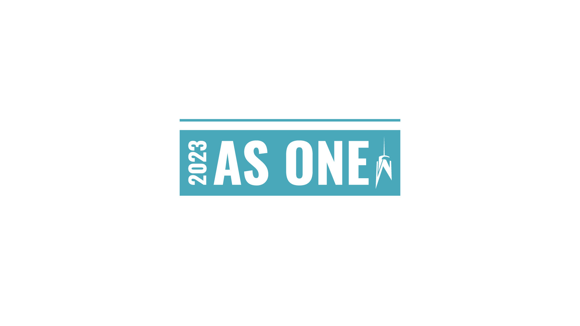
As One Wordmark horizontal blue text on white knockout with year and logo
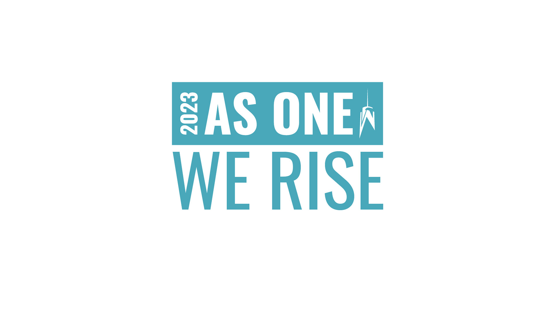
As One Wordmark horizontal white text on blue knockout with year and logo and "We Rise"

As One Wordmark horizontal blue text on white knockout with year and logo and "Together"
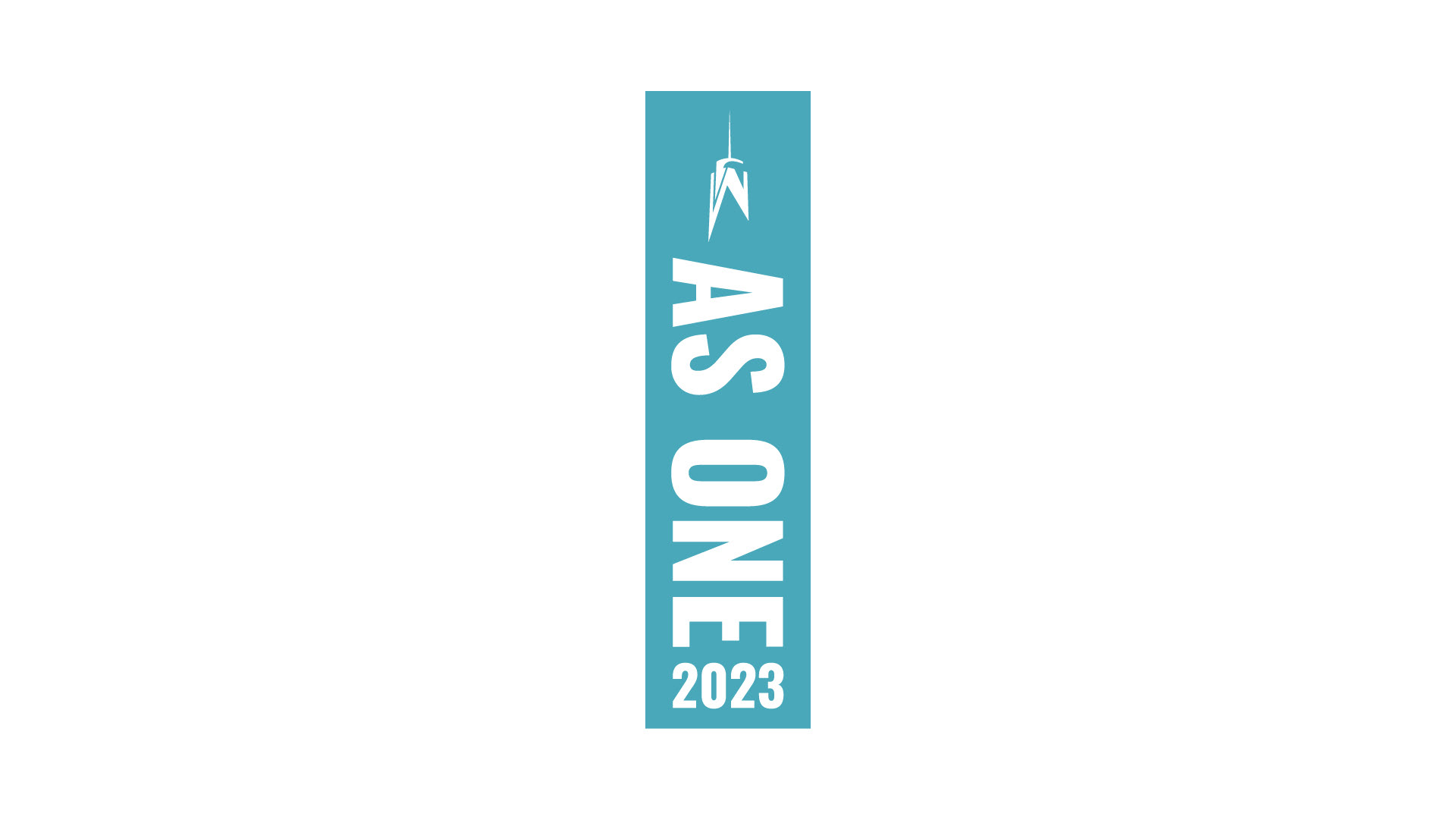
As One Wordmark vertical white text on blue knockout with year and logo

As One Wordmark vertical blue text on white knockout with year and logo
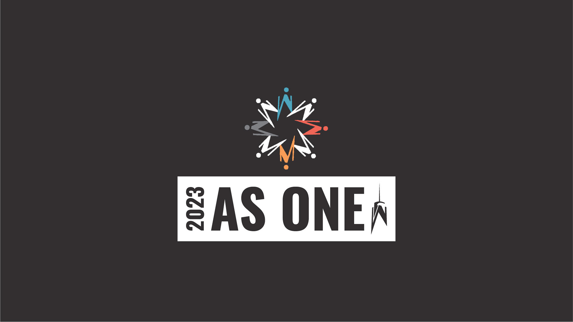
As One Wordmark horizontal blue text on grey knockout with year, logo, and One World Cares logo
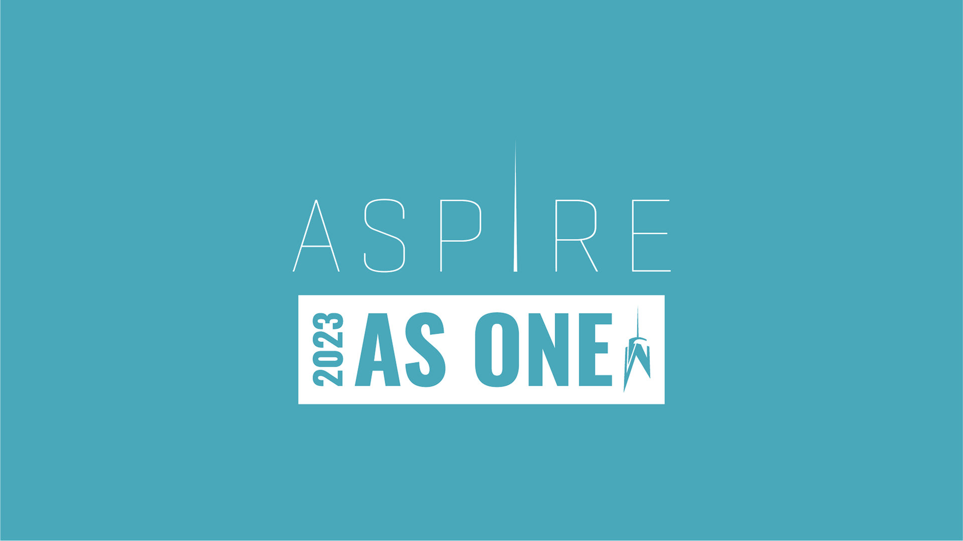
As One Wordmark horizontal white text on blue knockout with year, logo, and OWT Aspire logo
Below you can see my process from sketches to final deliverable. First, I created a word map to visualize the imagery that comes to mind when I read the slogan and see their logo. I sketched my ideas and came up with different solutions for their brief. My first round of sketches included ideas of using their logo as part of the wordmark "As one". I thought about interweaving the year between the slogan with a contrasting typeface. I also considered utilizing negative space to weave the number 1 within their slogan and using word maps with supporting words and phrases that the client supplied. After some rounds of feedback we eventually settled on a more simplified and streamlined design.
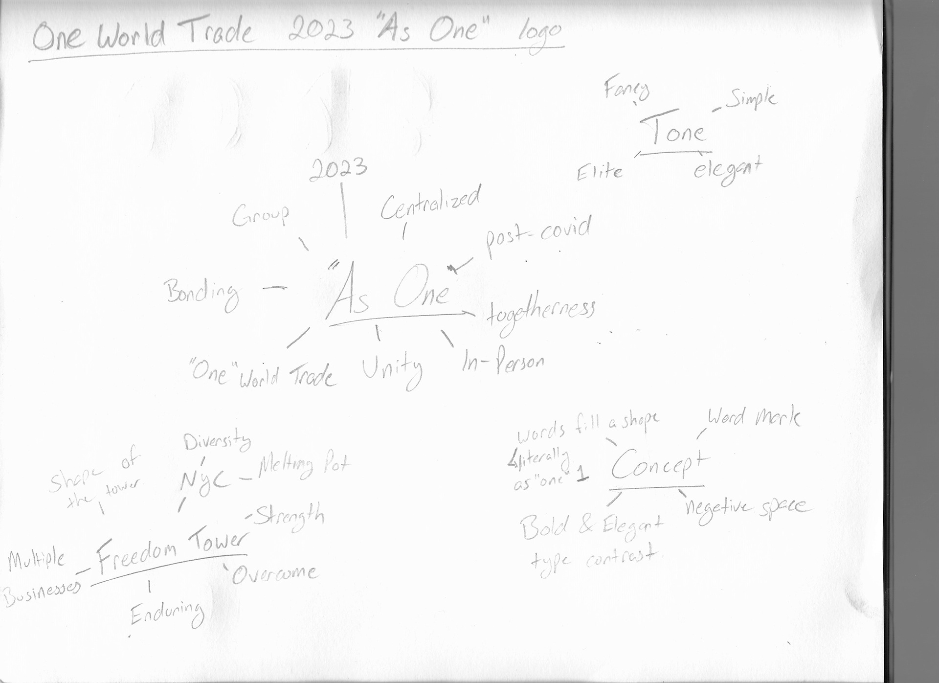
As One Word Map
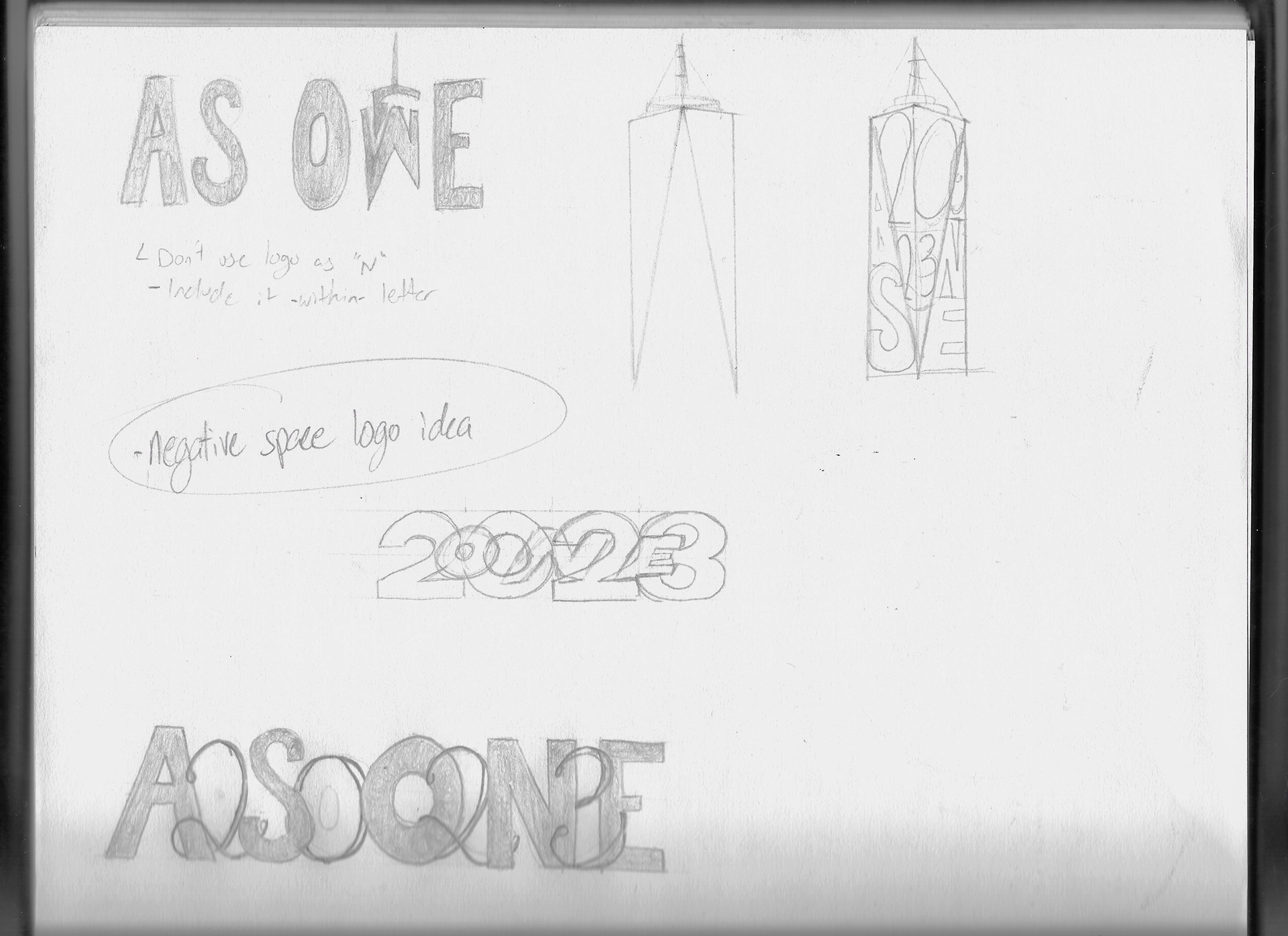
As One Sketches
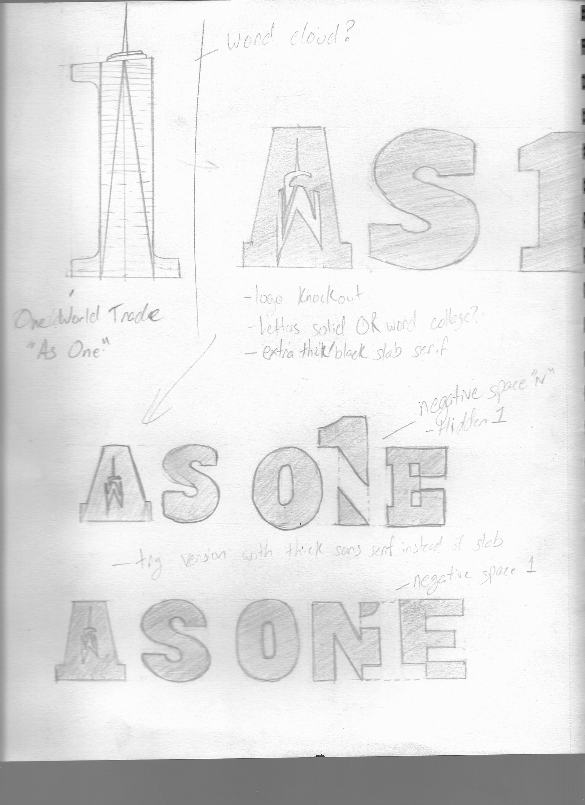
As One Sketches p2
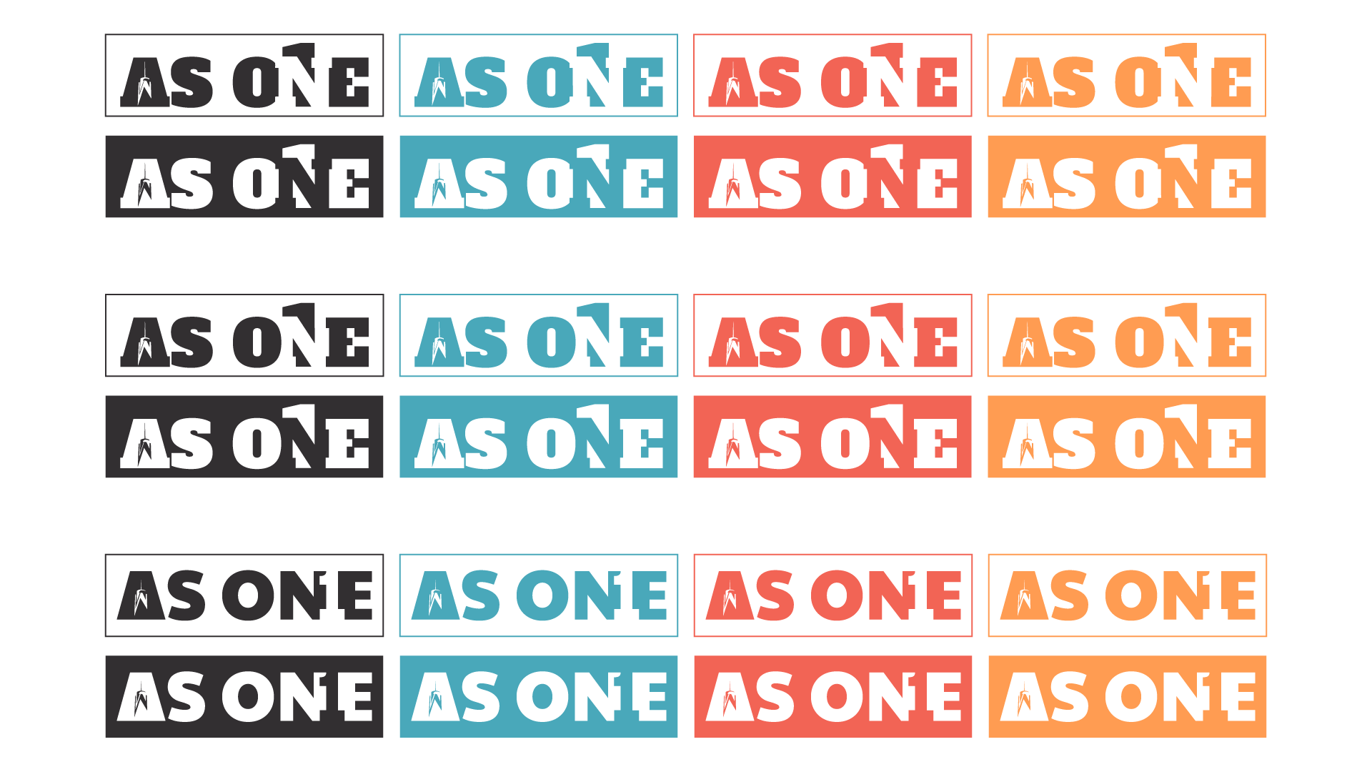
As One first round designs
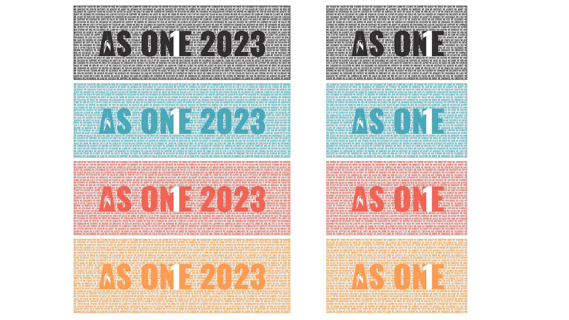
As One second round designs
As One third round designs

As One fourth round designs